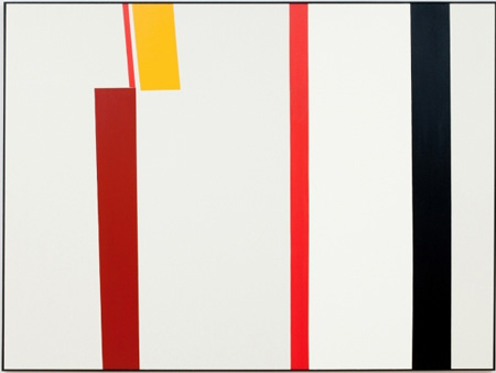
Continuing through October 21, 2012
When talking about what’s in Clare Rojas’ newest paintings in “Spaces in Between,” one must first address what isn’t in them. Rojas’ previous practice, showcased throughout the “Beautiful Losers” exhibitions of the mid-2000's, was marked by tapestry-inspired patterning, folk figures and thoughtful feminism. Where there was once an emphasis on narrative content, illustrative representation and an outsider aesthetic, now there are big, Modernist abstractions: minimal, flat and quiet.
On display are a mere seven paintings - five in the main gallery and two in the side room - but not for lack space to hang more. In the past it was not uncommon to see Rojas’ works hung salon style, gathered in tight groupings or amongst elaborate murals. Here, the abundance of that practice has given way to deliberate autonomy, sparsely installed so as to highlight the space in between, as the exhibition’s title suggests.
Initially, the paintings appear flat without much decipherable figure-ground, true patterning, or illusionistic space. Sharp, geometric forms dominate the canvases and their scale is assertive, though there’s none of the coldness or machismo associated with traditional Minimalist or hard edge painting. The whites are warm, and the colors applied with a careful but still human hand. Avocado green, ochre, maroon and grey-blue are instinctually nostalgic, recalling the palettes of retro design (an affinity also echoed in her recent collaboration with Incase, a company that creates products for Apple users).
Staying longer with the paintings brings out the deliberateness of the abstraction, as shapes produce the familiar angling of places and spaces, reinforcing the exhibition’s title once again. What used to be confined to the backgrounds of her representational practice are now at the forefront. Doors, hallways and windows emerge from particular placing of diagonal and horizontal edges in "Room with Doorway." The orange orb of "Lime Green with Circle" becomes about a sun setting in a desolate landscape. Time spent also reveals traces of their vernacular origins, as in "Star Pattern," which puts one in mind of a 1950s atomic starburst mirror or an Ohio Star quilt pattern.
The nostalgia, wit, and strangeness we’ve come to identify with Rojas’ practice are all still here, though they’re not exactly worn on the sleeve. It’s quite a feat to enact this kind of content through formalism rather than through narrative, and reading these paintings is not easy; there is plenty for a patient viewer to discover in “Spaces in Between,” but they’ll make you work for it first.
