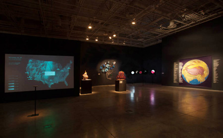
Continuing through January 26, 2013
A hybrid and rhizomatic exhibition, "DataViz: Information as Art" is a mash-up of Conceptual and Environmental Art as performed by old and new generations. Themes of social responsibility and global warming intersect with the age-old practice of manifesting numbers in a material form. Among the elders are Helen and Newton Harrison whose work has always been a mixture of social activism, community involvement and concern about the environment. Since the seventies, the Harrisons have attempted to raise the consciousness of locales they felt were troubled or in trouble, but here they have expanded their concerns to global warming. Covering a wall with maps and a recitation of the problem - the reluctance of developing nations to institute pollution controls, for example - the Harrisons suggest a solution which is positively chilling: A series of adaptations to help us all survive led by the very countries most resistant to change. Then there is another pioneer, Alice Aycock, who took up an obscure mathematical concept, the Enneper Minimal Surface, which is very difficult to visualize. "The Surface," named after Alfred Enneper, who discovered it in 1864, is always “minimal” but can be twisted and reconfigured in three-dimensional space through the use of differential geometric equations. Aycock bravely works with these equations to generate shapes, designed for installation art, and a series of exquisite drawings that are stunning in their precise beauty. The juxtaposition of the veterans of the Land Art movement and the contrast of political activism and mathematical abstraction illustrates the range of this exhibition.
Geographical information plays a role in keys works here beyond the Harrison's example. Sound artist Junichi Oguro and media architect Motohiro Sunouchics’ collaborate on an interactive project titled “Sound Mix.” The artists set up a globe visualized by clouds of placenames that resonate mixed soundscape. Throughout the exhibition the globe goes round, mixing the sounds recorded at two selected locations somewhere in the world. When visitors utter a placename into the microphone, the globe starts mixing sounds at the place and sounds are evoked. Another collaborative project called “The Living Air,” by Fernanda Viegas and Martin Wattenberg allows viewers to experience real time data showing a delicate visual pattern of wind velocities anywhere across the U.S. on a computer generated map simply by clicking on a location. Ingo Gunther’s lighted acrylic spheres allow us to select depictions of subjects as diverse as tectonic plate movements, wine production and consumption or ice drift stations studying climate change in the arctic.
Moving to popular culture, craft and weather, Nathalia Miebach builds models of "The Perfect Storm" - the Halloween storm of 1991 dramatized by the George Clooney-Mark Walberg movie. Echoed by a wall installation festooned by fans which chart the course of the hurricane along the Flemish Cap, these conceptual models, "She’s Coming on Strong, She’s Coming on Strong," are disconcertingly bright colored round globes mounted on round wicker bases surrounded by wicker rings which track the Storm through time and space. Miebach also appropriated these points or time line of the historic weather and transformed them into notes which are in turn set to music. The song played is "The Ghostly Crew of the Andrea Gail," based on a true story of another “cursed” vessel, The Charles Haskell (1870). Unlike the Andrea Gail, The Charles Haskell managed to escape sinking but was haunted by dead sailors lost at sea.
On the other end of the spectrum, Brian House’s "Quotidian Record" is literally a “record” two times over, a record of his travels every day of the year, translated into nodal points and imprinted on a vinyl platter, which plays music for eleven minutes. A generation after On Kawara, House plays on words (“record,” “note”) to produce a physical object and the length of the music equates to the number of literal notes made on each day for an entire year. Meanwhile, overhead a cyclone hangs at the far end of the gallery. The physical cyclone is based upon a two-dimensional model of an actual storm, which has been put through a three dimensional printer and materialized in fiberglass and aluminum. The resulting silvery shape resembles the Starship Enterprise and a coincidental red exit sign reappears as a red streak on the surface, giving the ominous circle the look of a Cylon Raider. "DataViz" raises questions about the presentation of complicated Post-modern art in a modernist manner, that is with minimal information, as if the art should “speak for itself.” If as the show claims, it is “information as art,” then perhaps the gallery should provide the information that was visualized in depth.
Published courtesy of ArtSceneCal ©2013
