Continuing through August 31, 2013
There is a mocking cleverness to James Verbicky’s continuing production of his abstract, mixed media paintings. But the humor is so sly it may be hard to tell who or what exactly is being speared. For that reason liking his work can feel like something of a guilty pleasure.
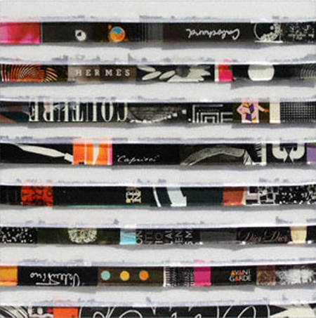
His paintings are large, with long layered bands of horizontal pattern made by slicing together fragments of printed designs, bright color and snips of text pulled from glossy magazines. Each running band neatly flips up at the bottom, giving the resin-coated surfaces a shallow depth and an appealing physicality. It’s a little like looking at a big, tight stack of glitzy magazine spines in a bookseller’s kiosk. The colorful staccato effect can be entrancing.
In part that’s because the fragmented texts Verbicky throws at us are not just empty words. They are the trademarks, name brands and logos of pricy, upscale consumer goods. There is something powerfully disconcerting in the way the assorted Gucci, Chanel, Vogue, Cinzano and other logos zing out from each painting to grab our attention. No matter that the artist will often invert the names, turn them sideways, or slice off a portion, they still remain identifiable. Indeed, so arresting are these commercial icons seeded amid the other bits of appropriated pattern and trendy color that we begin to seek them out. Hunting for other upscale logos we quickly become like those shoppers who look only for the names of famous designers or brands. That’s an interesting and uncomfortable position to have art put you into. One that subtly suggests that we consider not only the way the barrage of advertising’s media culture directs our consumer taste and choices, but can even call into question our fascination with the very art we are looking at.
To have artworks query not only the pervasive media culture, but their own participation or collusion in that conditioning gives Verbicky’s paintings a subversive cheekiness you don’t know whether to fully trust. These are works that seem to absolutely delight in the power of commerce to create a shared experience. In that way they remind me of Jeff Koon’s use of images from popular culture that mirror the way art itself amplifies and trades on imbedded structures of power and persuasion. It’s a tricky maneuver that can easily flip back on itself to look like empty pandering to the glitter of power, or worse, like a kind of dumb mercantile idolatry. Thankfully, most of Verbicky’s works negotiate that territory by leaving us in a limbo of our own indecision.
His paintings formally suggest the kind of iconic, abstract minimalist painting that corporations find so collectable and that some designers latch onto to transform into signature works. He repeatedly presents us with images like a simple circle uniting a bisected ground, or perhaps stacked lines of intense, fragmented color and pattern. “Diffuse 24” is a lovely image marked by sharp black textual lines that sensually bleed ripped edges into separating bands of transparent whiteness. It looks beautiful and decidedly collectable, but it gets its real kick from the way it also streams the signatures, logos and artifacts of commerce out at us like an unending tide of familiar music.
The decision to let the viewer reflect on what it is that is driving their fascination with what they are viewing is wicked fun. What is it that attracts us we wonder; aesthetic flair, visual familiarity, subversive critique, famous names? It’s a boggy ground because it reflects not only our own mixed bag of values and awareness, but the subliminal pressures advertising uses to get us to find personal meaning in the assimilation of exclusive brands.
Even this show’s title, “The Great and Powerful,” with its current media saturated Oz movie tie-ins and a wizard invisibly directing a fantastic emerald city, serves to suggest the way that art partakes of, and supports, a larger cultural psychology of power by association. Verbicky’s paintings make recognizing some of marketing’s covert associations a sophisticated game. A game that gently mocks itself and any willing participant while mirroring the way visual culture has been quite literally branded by commercial texts and images. That we find the game quite pleasurable tells us why it is also so profitable.
Published courtesy of ArtSceneCal ©2013
