The day I first saw LACMA’s exhibition featuring the plans for the museum’s ambitious new edifice by Peter Zumthor, I also visited the Museum of Architecture + Design across the street, to see their show “Never Built: Los Angeles.” At once entertaining and sobering, the show offered a dynamic glimpse at some visionary architectural designs for L.A. that, for good or ill, never got off the ground. While a handful of these visions (like John Lautner’s proposed nature center in Griffith Park) felt genuinely inspired, many more seemed misconceived, their never-built status a direct result of their own gargantuan hubris: one feels relieved they were not built, and instead safely stowed away for future meditation in the “What Were They Thinking?” file.
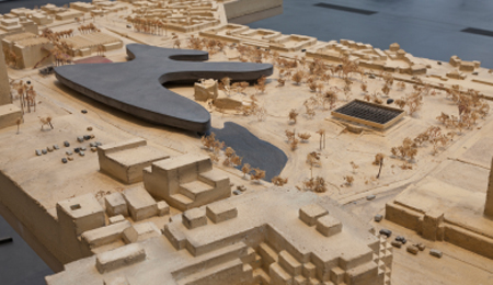
So far, it’s hard to tell where Zumthor’s LACMA plan will land: will it take form as a treasured city icon, or end up in the discard bin of grand, never-built flops? Or, worse, come into being as a lumbering letdown? Certainly, the proposal by the acclaimed Swiss architect does not want for ambition. The result of six years dialogue between the architect and LACMA’s tireless director/CEO Michael Govan, the plan, its cost estimated at $650 million, would entail razing most of LACMA’s older campus – the three original, unloved ‘60s buildings by SoCal modernist William Pereira, and the awkward 1980s add-on by Hardy Holzman Pfeiffer – and replacing them with a vast, undulating, glass-sheathed structure nicknamed “The Black Flower.” Drawing inspiration from the tar pits adjoining the site, the large (and oddly retro) globular edifice would sprawl across the campus, wrapping Bruce Goff’s celebrated Pavilion for Japanese Art in its curvaceous embrace. Not least, the plan would allow LACMA to get many more works out of storage and on display where they belong.
For now, critics in LA are giving the proposal deference. But a close look at the plan also reveals some fundamental design issues that are potentially problematic or unresolved. The first of these goes to the basic fact that the edifice would be boldly horizontal, with one vast, sprawling gallery level raised off the ground, via half a dozen curvy entrance modules which would also act as “study centers.” Yet in the models shown at LACMA, these entrances are left undefined. The reason for this decentralized format is that Zumthor and Govan say they want the new edifice to be “non-hierarchical.” But is the old design of several co-equal buildings really all that hierarchical? And is it really so archaic to have a coherent, engaging entranceway to welcome visitors to a museum? Furthermore, a vast amount of pedestrian space will apparently be created beneath the huge new structure. For all its flaws, one thing that works with LACMA’s current, eclectic campus is the animated public space between the buildings. The atrium of the original campus and the plaza facing the new buildings are lively gathering places used for dining and jazz concerts. Kiss ‘em goodbye. Instead, it seems we will be getting acres of shady, inefficient passageways beneath the building, in between these oblong entrance cores. This sounds like channeling the noirish side of LA’s cultural geography far more than its sunshine. One can easily imagine a creative curator devising an “Art in the Underzone” project to lend interest to these dim transitional spaces, which as is seem only vaguely thought-out.
Likewise, the building’s relationship to its streetscape seems indifferent. I’m not saying such a bold, autonomous form can’t work on its own dramatic terms, but the edifice seems designed more to be viewed from the air (or as a snappy logo), than from Wilshire Boulevard. As is, the shape is so huge that it juts over the tar pits, a gesture both tactless and inept. And there are other questionable issues: the single gallery level as depicted in the (rather severe) models seems to loom 40-50 feet tall: an imposing scale for the intimate contemplation of art. And its layout, as is, seems to be a rambling, mazelike warren. Might a more compact structure that entailed two stories of galleries be more navigable and efficient?
It’s worth noting that earlier visions for LACMA all seemed dramatic and visionary in their day. But those that were realized – including BCAM, built just five years ago – have proven far clumsier in reality than in the giddy, fund-raising stage. That’s not to say that Zumthor’s inventive design isn’t compelling; but at a cost of $650 million, elimination of its original campus, and who knows how many years prior to actual completion, it's vital to address such questions now. To succeed, Govan will need to engage Zumthor, not as a minimalist artist whose ideas are sacrosanct, but as a flexible, open-minded pragmatist. Zumthor’s other completed cultural spaces evince a powerful and elegant austerity, but they’re also much smaller in scale. Before LACMA demolishes its own imperfect historical buildings, it must go father to refine its grandiose plans, lest they too wind up in the “What Were They Thinking?” file, victim of their own sumptuous impracticality.
