Continuing through January 3, 2015
At what point does an artwork lose self-sufficient autonomy and become a decorative element or component in an architectural or interior design environment? This is the by-no-means irrelevant question raised by the art of Jeff Fontaine. Now 40, Fontaine has been exhibiting steadily in California, Colorado, Utah, Idaho, Oregon and Washington since his 2000 graduation from Western Washington University.
Because 22-gauge steel panels rather than stretched canvas or wood form the supports for the application (in stages) of his acrylic paint, Fontaine enters the gray area normally inhabited by enamellist-painters such as Pacific Northwest artists Harold Balasz and Jerry Schneiderman who, unlike Fontaine, fire works after painting. The results are often remarkably similar, as are the potential pitfalls. Alan Fulle, another Seattle painter, stacks layers of clear poured-and-colored resins over wood panels. All of these artists work in abstraction; Fontaine similarly achieves clouded, irregularly edged color-block areas, a heightened materiality and unattractively smooth, shiny surfaces.
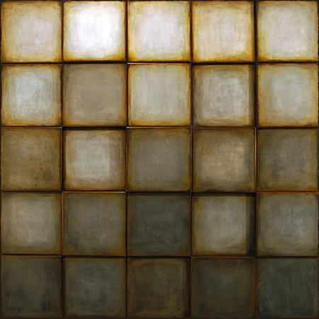
Fontaine’s new work displays a variety of approaches, wavering between slick, gridded rectangles and squares, and compositions with less ordered rows of squares. Included are several works that might point a way toward more adventurous, less predictable compositions. Along more ordered lines, the “Spectrum” series stacks squares of varying colors five-atop-five that distantly echo Bauhaus master Josef Albers, but with none of his theoretical impact. More blurry and nuanced due to Fontaine’s process, “Nos. 1, 2 and 3” are impressive, poetic and faintly recessive in their presence. This is one point at which their autonomy from mere decoration is heightened. “No. 2,” however, a study in 25 different shades of gray, resists this tug by going in the other direction: it is so un-chromatic and minimal that its darkened lower third pulls tremendous visual weight.
“No. 4” consists of four interlocking diamonds, each with its own four diamonds of alternating blue, pink and orange. Here, too, especially with a sense of each “tile” positioned in relatively deep relief, any surface activity is highlighted by the strong material presence alone.
“X2” and “SRK” allude to possible landscapes with their upper blue “skies” and lower red-brown “earth” areas. A punctured circle outline overlays “X2” while the staggered brick pattern of “SRK” reduces color to a blue-red dialectic. Bigger and even simpler, “A70” has two white breathing spaces among red and blue squares above four three-foot-wide bands of, respectively, blue, yellow, red and pink.
Fontaine’s strategy of a narrow palette may inadvertently punch up a decorative or design potential throughout, but fortunately evades that charge in three final works that point toward more complicated fields of imagery, mark making, and use of color.
“EAG” stretches the staggered brick motif to an upper-lower-middle configuration so the taller middle section actually suggests looking through the window of an industrial building toward sunlight. With a lot more to look at, “EAG” also introduces multi-colored diagonals pointing toward its center. In “LO97,” four high-relief “shelves” hem in 20 vertical zigzags that illustrate a welcome, wider spectrum. Ambiguous and conflicted, color seems about to be released — or further absorbed into the shimmering gray background.
Finally, all rules are broken in “YRK-1.” Drawing on early 20th-century American synchromism (see Stanton Macdonald-Wright) and middle-period Paul Klee, Fontaine pits tilting color posts against a lower quilt of vivid color squares. While he cannot resist the safety of the by-now oppressive black outlines of the four rows of staggered see-through shapes, this degree of risk and freedom in Fontaine is nevertheless encouraging. Only three by two feet, “YRK-1” and its future ilk must be expanded and proceed from such a glowing example.
