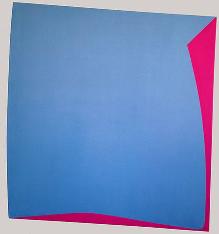
Continuing through December 7, 2017
One of Sheldon Figoten's favorite artists is John McLaughlin, whose life work was celebrated earlier this year in a stellar retrospective at the Los Angeles County Museum of Art. In 1980, Figoten paid homage to McLaughlin by publishing an article entitled "An Appreciation of John McLaughlin" in the Archives of American Art Journal. In his essay, Figoten acknowledged McLaughlin's influence on Southern California abstract artists working in the 1960s, including Ed Moses, David Novros, Ron Davis and Tony DeLap, as well as on a younger generation who emerged in the 1970s, of which Figoten is part .
Figoten believes that McLaughlin's geometric abstractions are significant because they can open doors of perception by inducing "within the spectator the sensation or consciousness of insight" (Figoten quoting McLaughlin). In particular, Figoten admires McLaughlin's ability to balance dualities within a single painting in order to evoke in the viewer Zen-like states of "nothingness,” which, influenced by the Japanese art he collected and sold as an art dealer, McLaughlin referred to as "the void."
Like McLaughlin, Figoten's goal as a painter is to provide experiences of heightened perception. In his essay, Figoten discusses McLaughlin's use of a reductive formal vocabulary that "provokes, puzzles, and unbalances, awakening the viewer's senses." Yet, in contrast to the moments of meditative calm and stasis that can result from engaging with a McLaughlin painting, where a move in one direction seems always to be balanced by a shift in a counter direction, the effects of a Figoten painting may be more disconcerting or playfully jarring.
In the ten paintings that comprise "Light Fields," Figoten encourages us to experience perceptual states of awkwardness, tenuousness or instability. In a manner that recalls Theo Van Doesberg's preference for active diagonal lines as a response to Mondrian's restrictive vocabulary of verticals and horizontals, Figoten has forsaken the rectilinearity of McLaughlin's formal syntax in favor of curves, angles and trapezoids, while animating these forms using contrasting textures painted with pearlescent and fluorescent pigments. The former are applied with a roller to produce monochromatic fields, while the latter are painted on with sponge brushes to create "trims," smaller sections along a work's edges or at its corners.
Figoten also employs a methodology popularized by Josef Albers in his "Homage to the Square" series, employing a particular motif repeatedly, while varying the colors from canvas to canvas. Here too, Figoten is less restrictive in his approach. Whereas Albers' concentric square configurations use a consistent format throughout — squares always aligned uniformly with other squares — Figoten creates subtle variations in the shape, proportions, and positioning of a repeating framework.
Figoten titles each work simply with the date of completion and, in most instances, includes a parenthetical subtitle alluding either to an image source or a compositional attribute. In a majority of the new works, Figoten's repeating motif is loosely based on curvilinear shapes derived from Japanese pottery, hence the subtitle of each of these works is "Vessel." In most of these, we are presented with an optical illusion that functions like the well-known figure-ground vase, where our cognition of what we are seeing fluctuates back and forth between being a vase set against a background and two facing profiles in silhouette. In "July 11, 2017A (Vessel)," where a dark pink center seems to dominate a bright yellow trim, one's first tendency is to see the vessel, which seems tightly stuffed into the painting's trapezoidal perimeters. By contrast, a dark blue trim seems to overpower a pale yellow center in "May 18, 2017B (Vessel)," such that the vessel shape becomes less immediately decipherable.
In another group, the trim functions like a framing device that wraps around all of a work's edges. "June 4, 2014A (Spinner)," for example, sports a hot pink trim that frames a large gray square, but the two are slightly out of alignment, with the trim angled leftward to yield the effect of a continuous and rapid movement that seems to alternate between moving clockwise and counter-clockwise. The turquoise trim that frames a hot magenta center in "March 4, 2017 (Puller)," on the other hand, moves decidedly clockwise because the painting is hung on the wall at a rightward tilt.
Perhaps the most playful painting in the exhibition is the only one that has no subtitle at all. Deliberately lopsided and tilting downward to the right, "December 27, 2016B" contrasts a blue field that is completely open at upper left with a luminous dark magenta trim embracing the work at the lower right. No matter how hard we may try when connecting with this painting, there is no escaping the resultant feeling that we are being forcefully yanked to one side.
