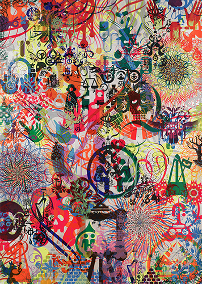
While the exterior of each building of the industrial complex that hosts the gallery looks about the same, the interior of each individual space differs wildly. It’s an apt context for Ryan McGinness, whose brilliantly colored and graphically aggressive paintings utilize signs and symbols that range from corporate logos to invented visual languages that are layered and dynamically spaced for maximum effect. Eight large-scale paintings that command the special projects gallery push an aura of energy into the center room. The painting “Import Data” is a good example, as what seems like hundreds of signs and symbols overlap one another, visible through slightly transparent layers of paint. The imagery is seemingly recognizable, yet upon closer inspection the familiarity dissipates and one is left wondering what is being communicated.
“Don’t Stress the Machine (Blue)” is slightly different because it features a view inside the artist’s studio. While the bright colors remain, the flattened depth allows for a much more linear reading of objects one might expect to find in such a space. The exhibition rounds out with a number of smaller cyanotypes that further display the artist’s experimentation with form. These are hung from the floor to the ceiling of the back wall of the gallery in an organized grid. What’s impressive throughout, however, is how McGinness undermines our visual process, a disruption that is constructive because it sparks a new dialogue.
