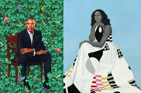
The unveiling of the portraits of the Obamas for the National Portrait Gallery — Barack Obama by Kehinde Wiley and Michelle Obama by Amy Sherald — elicited the expected reactions from various sectors of the electorate. Unstinting praise from liberals, in general, swayed by affection for our exemplary First Couple, with art-world approbation for the deviation from the old-fashioned stodginess that we associate with presidential portraits. While I share that affection for the Obama’s and appreciate their interest in supporting black artists, I can’t help but feel that the paintings do not accurately commemorate this historic administration. The styles are inappropriate.
Wiley’s Schiele-like magnification of head and hands may please those who make fun of 45’s small hands, but it seems to be slightly disrespectful to ‘fix’ 44’s hands, and the hedge of symbolic flowers seems to me a rationale for the artist’s love of what resemble wallpaper patterns. Sherald’s likeness of FLOTUS is not great, with the drawing of her famous arms particularly boneless, and whatever political convictions may be implicitly read into the dress, midway between quilting and Carnaby Street Pop, the subject gets rather lost in it. The intelligence, charm, dignity and humor of the Obamas is swallowed up in each artist’s signature styles and retroactively applied political symbolism, i.e. allegory.
That said, I thought it might be interesting to consider other works in the National Portrait Gallery (follow along at http://npg.si.edu/portraits/collection-highlights/presidential-portraits). Contrary to popular belief and the current fashionable rejection of dead-white-male art and culture, there are many quite good works in the collection; lots of mediocre ones; and a few that are downright awful.
By good, I mean fundamentally realistic, but with enough idealization and theater for the intended audience of voters in a democratic republic: POTUS as primus inter pares, first among equals, as was said of Washington, first among equals. Note that I do not evaluate the portraits based on my politics: a good painter can make a bad president look great (George Peter Alexander Healy’s James Buchanan), and vice versa (Robert Edge Pine’s George Washington). Evaluating artworks based on politics or morality is a bad habit inculcated by postmodernist education that we in the art community need to outgrow. Ask the bad boys — Caravaggio, Bernini, Picasso and Lucien Freud — or any premodern artist who used his gifts to serve ideology and power not to our liking. Among the good to great NPG portraits I would list these fifteen, in chronological order:
1. John Trumbull’s John Adams (1793)
2. Gilbert Stuart’s unfinished George Washington (1796)
3. Gilbert Stuart’s almost Impressionist Thomas Jefferson (1805/21)
4. John Vanderlyn’s James Monroe (1816)
5. Albert Gallatin Hoit’s William Henry Harrison (1840)
6. James Reid Lambdin’s Zachary Taylor (1848)
7. George Caleb Bingham’s John Quincy Adams (1850)
8. George Peter Alexander Healy’s Franklin Pierce (1853)
9. George Peter Alexander Healy’s James Buchanan (1859)
10. Matthew Wilson’s Chester Arthur (1883)
11. Thomas Le Clear’s Ulysses S. Grant (1880)
12. Ole Peter Hansen Balling’s James Garfield (1906)
13. Bernard Safran’s Richard Nixon (1960)
14. Ronald N Sherr’s George H.W. Bush (1994/95)
15. Robert A. Anderson’s George W. Bush (2008)
Mediocrity is reserved for works that fail, for a variety of reasons: incompetent execution; too much realism for comfort’s sake; kowtowing to fashion; egregious falsification, i.e. propaganda. I regard the worst executed of the NPG paintings to be Robert Edge Pine’s George Washington (1790), simply an embarrassment. The most tasteless is Michael O’Brien’s 1989 magazine-cover-style photo of Donald Trump tossing an apple. The most banal are the blandly generic, overgeneralized waxwork figures depicting McKinley, Wilson, Coolidge, Hoover, Truman, Ford and Reagan, the epitome of which is Robert Clark Templeton’s Jimmy Carter (1980), a stick figure lost in space.
At the opposite end of the spectrum are those paintings that are too warts-and-all realistic, Too Much Information. We start here with Rembrandt Peale’s unsparing 1795 look at a worn out George Washington. August Benziger’s William McKinley (1897) could be a gangster. William Valentine Schevill’s William Howard Taft (1910) and Anders Zorn’s Grover Cleveland (1899) depict those two worthies as — at least by current standards — uncomfortably stout. Peter Hurd’s Lyndon Johnson (1967), never exactly photogenic anyway, provoked that President to remark the portrait to be, “The ugliest thing I ever saw.”
Then there are those that were competently painted, but either too stylishly rendered or false in their representations — the Chinese selfie app Meitu, loosely translated as Beauty Face, comes to mind. Charles Bird King’s 1836 copy of a Gilbert Stuart 1826 profile of Thomas Jefferson in Roman-medallion style is misguided. Margaret Lindsay Williams’ Warren G. Harding (1923) presents the handsome Chief Executive as a fashion plate. Norman Rockwell’s Richard Nixon (1968) is pensive and benign, with a rubber arm four feet long, all the better to bring us together after the subversive tumult of the Chicago Democrats’ convention that year, to peace with honor. Oops, there I go again, brainwashed by George Soros.
