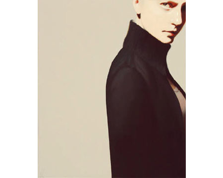
Even with fast and wide praise of her paintings since her first solo show in 2003, Santa Fe–based artist Erin Cone continues to push her work, and it shows. Cone consciously explores new approaches to form, composition, and palette, and her current solo exhibition shows the painter refining and developing.
Cone paints stylized figures based on herself (These aren’t self-portraits, however; Cone acts as model, not subject). She says, accurately, that her work is a fusion of figurative realism and abstract minimalism. The figure is almost always solitary against a flat background and usually cropped in an arresting way — off to one side so as to crop out an arm, three-quarters of the head cut off. These works are as much about form and arrangement as they are about the figure itself. And they are strong; this is made obvious when noting that the impact of the work isn’t diminished when showing the figure from behind, typically a less engaging view.
Numerous influences and art historical connections can be seen in Cone’s work. The clean, stylized approach of the neoclassicists, albeit with a fresh approach; Cone’s figure, dressed in “office casual,” is a modern woman. Contemporarily, there is a resemblance, especially as regards cropping and also stylization, to Kenton Nelson. Cone herself cites influences from Georgia O’Keefe, Caravaggio, Édouard Manet, Gerhard Richter, and Wayne Thiebaud, among others. Her historical influences — she’d originally aspired to be a portrait painter in the Old Master tradition — are contrasted by the bold, commercial feel of graphic design and the slickness of photography. Her surfaces are clean and smooth, unblemished. (Cone worked as a graphic designer at a publishing company before taking the leap to devote herself to painting full time.) Inspiration also comes from collage, fashion, and dance.
For this body of work, Cone has limited her palette. She’s playing with levels of contrast. Some work features less, such as “Away,” a quiet work with a sepia-toned appearance. “Allure” shows a cropped upper portion of a figure with a bright red shirt against a blue-grey ground. But gone are, say, the hard orange backgrounds of past work. The new-found subtlety is welcome. Cone also softens her images and adds movement by showing afterimages, hints of where the body just was and the implication of movement that goes with that. The rendering of the figure itself, verging toward realism, gives these paintings greater life and depth; they energize the work more than in the past, and they’re simply better painted. Cone’s work at times becomes prettified, or on the other hand it’s flat, graphic component becomes rigid and predictable. But she is engaged in seriously honing her craft and working through formal concerns. It’s an exciting process to watch and no small pursuit.
Here we see a dedicated, talented painter steadily developing into an artist.
