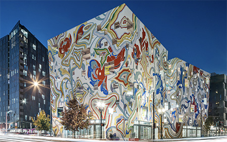
Here in Portland, Oregon, we’ve seen a major building boom accelerating exponentially over the last five to ten years. Old-timers bemoan the burying of long-cherished landmarks beneath metastatic mounds of new construction, mostly condos, apartments and offices. A few of these structures are beautiful, most are selfsame and anodyne. Some get under my skin because they follow a new trend of cavalierly superimposing visual art onto the exteriors of residential and commercial buildings. Rather than let architecture do its own heavy lifting and command the eye through the poetical and functional qualities of form and space, architects are increasingly taking the easy way out and shoving more and more of the responsibility for beauty and spatial interest onto the realm of two-dimensional art. Call it “mural madness.”
An example. In late spring 2017, a new building went up on the east side of the Burnside Bridge in downtown Portland. It consisted of two top-heavy, slightly warped cubes punctuated by irregularly sized, whimsically placed windows. Outdoor walkways connect the two wings. During construction the exterior was an appealing eggshell color, which accentuated the project’s quirky shape and lent it an ambiance that felt at once prehistoric and futuristic. At last, I thought as I saw it taking shape, a building we can be proud of: an individual among clones! Then one day as I was crossing the bridge I saw what can only be called a bastardization in progress: the pristine façade was being desecrated with a vulgar hyperchromatic mural depicting what looked like abstracted protozoa as viewed by a lab tech on L.S.D. The building’s form had been lost in a glut of cutesy, iPad-generated-looking claptrap.
In fact, the design was done by Los Angeles-based artist James Jean [http://www.jamesjean.com/], then executed by Portland-based artist/muralist Dan Cohen (https://dc-creativelabs.com/). I don’t want to knock either of these artists, who were just performing a job they were hired to do by the building’s developer, Kevin Cavenaugh of Guerilla Development, and FFA Architecture and Design, with creative guidance from the Regional Arts and Culture Council. That many cooks in the kitchen brings to mind the old adage, “A camel is a horse designed by a committee.” The name of this travesty, not incidentally, is the Fair-Haired Dumbell Building, a fittingly imbecilic moniker for a once-promising structure reduced almost overnight to a second-rate parody of third-rate graffiti (and I write that as a fan of graffiti).
As far as I can tell, my viewpoint is the minority opinion among Portland art lovers. Most people I talk with about the building think the painted aspect is its strongest suit — it’s fun, after all, it’s happy-making, it doesn’t take itself too seriously. I have to agree to disagree with a colleague I respect tremendously, architecture journalist Brian Libby, whom I regard as one of the finest culture reporters on the West Coast. In his review in the Portland Tribune and a related blog post [https://chatterbox.typepad.com/portlandarchitecture/2017/11/colorful-whimsical-and-contrarian-visiting-the-fair-haired-dumbbell.html], he conceded that “the Dumbell is playful enough to seem trite” but confessed to being won over by its sheer ebullience in a town rife with S.A.D. sufferers: “In a gray and rainy climate,” he wrote, “its wild colors and multi-story imagery provide a welcome respite.” To each his own, but I’d rather stare into a light-therapy box than at this cartoonish eyesore.
There are other mural-forward buildings locally that repeat similar mistakes. The SOLTerra Office Building [https://www.instagram.com/p/BxaRXNhBnIK/?hl=en] at 959 Southeast Division Street has become a popular spot for Instagrammers, with its 70-foot-tall mural by an artist who goes by the handle “Fin DAC.” Entitled “OSolTerrace or Woman-Sun-Earth,” it’s a full-length portrait of a woman raising her arms in a “Namaste”-like greeting. Her hair is made up of actual growing plants. Some social-media denizens have opined that the work traffics in cultural appropriation, accusing it of pastiching ethnic features to evoke a Space-Age geisha girl, but for the most part, tourists and locals are charmed. “Those are actual living plants starting to take root in the woman’s hair,” exclaims an article in PDX Urban. “How cool is that!!?”
Then there is a new building underneath the east end of the Morrison Bridge. It’s called “Tree Farm” [http://www.brettschulz.com/tree-farm-1], and yes, it features dirt-filled metal pails up and down the façade with small trees inside each one. The exterior is painted, stencil-style, with a circular floral motif in shades of blue and yellow. The developer, Kevin Cavenaugh of Dumbell Building infamy, says he wanted the building to look “like a big-ass Chia Pet!” Well, okay. Sixty-one years after Frank Lloyd Wright’s death, 55 years after Le Corbusier’s, this is what our architectural discourse has come to. Can you picture Wright’s Guggenheim or Le Corbusier’s Notre-Dame du Haut chapel in Ronchamp if their austere bone-colored exteriors were instead tarted up with slapdash amoebae forms and sundry shrubs?
I’m all for material experimentation and innovation. I love exteriors that make a statement. Santiago Calatrava, Jean Nouvel, the late Zaha Hadid are geniuses who push the boundaries of their profession. They do it without cheap, throwaway gestures that pander and condescend the viewer. They trust the three dimensions. They do not need to plaster a super-enlarged iPad-aided 2D mural onto exterior walls to cover up bad design or, even more unforgivably, good design. Architecture is its own art; it needn’t pilfer 2D art’s coffers, nor raid the tree nursery, to buttress its cachet.
