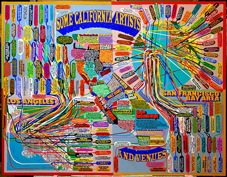
If Donald Trump can’t read a simple graph, imagine how he would fare attempting to interpret charted information by artists who create complex diagrammatic renderings of all kinds of data. Considering his lack of interest in anything other than Trump, 45’s uncurious eyes will likely never see a work of text-based conceptual art. But for those who like visual poetry or puzzles, illustrations of relationships among things, layering of meanings, and novel, playful, or complex ways of seeing and interpreting, I would recommend some artist’s charts to peruse while riding out the pandemic.
For art history buffs, one should begin this investigation with the work of the New York School painter Ad Reinhardt. Although best known for his monochromatic black paintings that are very meditative in tone, Reinhardt is also recognized for his political cartoons attacking Fascism and racism or lampooning the art world. These topics are as timely today as they were from 1942-47, when he contributed to the leftist publication ”PM”. He confronted the latter topic in his cartoon “How to Look at Modern Art in America,” first published in ”PM” in 1946 and then updated for an appearance in ARTnews in 1961.
Likely inspired by the Museum of Modern Art founder Alfred H. Barr’s well known 1936 diagrammatic flow chart illustrating the relationships among the various Modern Art movements, Reinhardt expanded the concept, using the metaphor of a tree with roots, trunk, branches, leaves, suspended objects, and a nearby cornfield with scarecrows all bearing the names of artists, art movements, art genres and mediums, along with a few references to consumer culture. In this and other of his witty illustrations, Reinhardt employed a diagrammatic visual analysis to point to the complexities of historical documentation, while also suggesting that history and organic growth in general are non-linear in nature. This idea is particularly significant in the context of the time period of the updated version, because art historians and critics were by then teaching just the opposite. The formalist art critic Clement Greenberg, for example, simplistically conceptualized the history of Modern painting from Impressionism through Abstract Expression as a single-line development from illusionism to flatness.
Today we can find noteworthy examples of Reinhardt’s approach in recent works by the New York artist Loren Munk and Los Angeles-based Keith Walsh. Munk, aka YouTuber James Kalm, began making art world map paintings in the early 2000s and one of them, “A Tree Grows in Brooklyn,” is an art historical descendent of Reinhardt’s illustrations in that the data — in this case the addresses of Brooklyn-based artists — is inscribed on the leaves of a tree. But the similarities end there, because the tree’s roots are attached to locations on a map. In paintings that document the populations of various art scenes, including SoHo, the East Village, Williamsburg and even California, depicted street maps are the starting points for massive accumulations of data inscribed in tiny tabs or word bubbles, all connected to points on the maps. Using an additive process, Munk crams in as much information as he can, often correcting errors along the way, until there is no available space left to fill. With their bold multicolored patterns, the paintings resemble a cross between subway maps and 1950s children’s game boards. Aesthetically dazzling and with so much to discover, each is an inquisitive viewer’s paradise.
Keith Walsh’s recent works on paper also resemble subway maps to some extent, but his content derives from the history of politics rather than art. Walsh’s focus over the past few years has been on what he describes as “the historic connections of socialist activism and black liberation activism in the U.S.A. and, particularly, in Los Angeles.” Drawn in black and red colored pencils mixed with bits of dust, the linear networks in his drawings are rendered in a graphic style that was popular among Russian political poster artists of the 1920s. Placement and directional shifts are determined by ideological positions of historical figures or movements whose names or emblems appear within a work’s overall linear matrix. A line’s shift to the right, for example, means the person or group became more conservative. One of the most compelling examples, “Black Liberation and Socialism #1,” is visually dynamic and particularly useful in helping us to understand that the current Black Lives Matter movement did not emerge in a vacuum. With a powerful Black Panthers symbol at the helm, the composition plots out the relationships among Martin Luther King and the late John Lewis, Angela Davis and her philosopher mentor Herbert Marcuse, and from there even Marx, Trotsky and Lenin. As teaching aids, Walsh’s drawings offer up multitudes of topics for further study. As artworks, they stimulate both the mind and the eyes.
At a time when Covid-19 and the failed policies of Trump and his Education Secretary Betsy DeVos have left public schools in the United States is in such an uncertain state, educators teaching remotely might look to Reinhardt, Munk, and Walsh for attention-grabbing models that are deep, substantive, and anything but dull.
