Continuing through December 23, 2022
What does it mean to be “a really good painter” these days? Among other things, it’s the ability to make not just images, but images-cum-objects, that make the viewer stick around for a bit and really look, really see, and, in some cases, make us feel something — regardless of subject matter.
In “True Believer,” a group of 16 paintings ranging in size from about 4 by 3 feet up to about 5 1/2 by 8 feet, Matthew Cerletty is able to produce the former (looking) while being rather aggressively devoid of the latter (feeling). Cultural references abound, from brands to nature to the acts and tools of artmaking themselves. The emotional baggage, by and large, is thoroughly syphoned away, leaving us with the residual images in near pure objecthood. In many of the works, this amounts to some sublime object gazing, and I don’t mean that counterintuitively: many of the paintings, two-dimension as they are, have a sculpted-ness to them — whether a giant green leaf, with all its veins and folds, a neat stack of moving boxes well-sealed with packing tape, or a brand logo stripped down to its core design — which is highly satisfying.
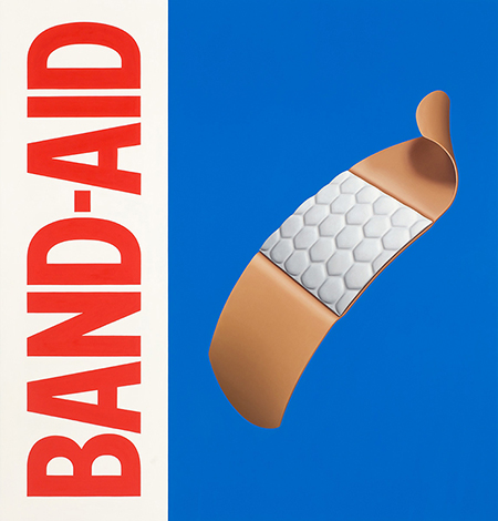
Among the best works of the bunch is “Band-Aid,” which features the brand’s iconic red lettering in vertical orientation, along with the right three-quarters painted a cobalt blue (a more aesthetically pure variant of the box’s actual ultramarine tone). A gently curving Band-Aid strip floats in the foreground, the ‘flexible fabric’ version, it turns out. Cerletty is mining a quintessential Pop Art format, but with associations so benign that it becomes more about raising the mundane to a sublime object through aesthetic mojo as opposed to reveling in Pop-Art nostalgia or universality. That gently curving Band-Aid strip, with its downy soft, cushioned pillowy pad, strives to be more about visual perfection than something in the realm of sentimentality or Pop matter-of-factness; the field of blue the Band-Aid is floating on is devoid of the descriptive text you get on the boxes you get at the store.
Not dissimilarly, “Pretty Woman,” stripped down to the logo from the notorious 1990 movie, is another vertically oriented, sideways band of text in pink with subtle orange-yellow outlines on an otherwise all-white background. “Dartmouth” is a long horizontal green-on-green logo of just the school’s name. Among other Pop-oriented artist forbears, the obvious go-to would be Ed Ruscha (visualize his painting “Boss”). But when I was lingering through Cerletty’s show, I’m not sure Ruscha ever came to mind; neither even did Warhol, or perhaps only barely, at least at the time.
That critical lens of art historicizing need not be applied in taking in the work as an experience. Rather, you’re able to soak in the images-as-objects; it’s about good ol’ visual pleasure. Paintings such as “Pretty Woman” and “Dartmouth,” while they bring varying waves of cultural associations — despite Cerletty’s ability to hollow out most of the signifiers — may still carry too much needless baggage, though one could argue that that tension, between objecthood despite references and imagery through references — is what gives the work its deadpan edge. “True Believer” can be interpreted in multiple ways, but for me, the only true believing worth mentioning is the belief in painting itself, despite, you know … everything.
