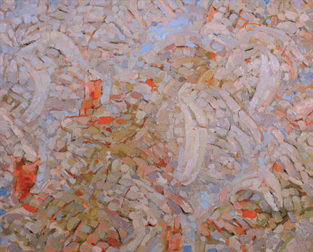
Eric Elliott lays it on thick. His richly textured oil paintings of grey on grey depict blurred scenes from his studio. The subject matter is mundane: a pair of chairs here, a plant there, a cookie jar that nearly fades into the background. Quiet still lifes are made nearly unidentifiable by the draining of color and by the overwhelming patterns of paint.
Elliott’s pieces are filled, over and over, with short, finger-like, daubs of oil paint. The markings accumulate with a sensual heft that renders his subjects nearly abstract. Details of objects are obscured by the pattern of application, in a way that negates the physical nature of the subjects themselves. The paintings are about the paint.
Color is minimal in these busy rectangles. The most striking pieces are those in which the greyness and abstracted still lifes force the viewer to appreciate the viscous nature of the media. “Cookie Jar” and “Fading Still Life” are two grey color fields that almost completely obscure what they depict. This pair of works seems to have been executed with a very controlled hand. Each daub of paint is nearly rectangular, and the brush seems to conform to a very limited range of motion. In “Cookie Jar,” all markings are rendered on the diagonal, while in “Fading Still Life,” all brush strokes seem to be vertical or horizontal. One cannot help but appreciate the diligent labor of the artist’s hand. That effort, all that placement of pigment, is tangible.
Using the trappings of the traditional still life, Elliott inverts that trope. Instead of using paint to capture a scene, he uses the excuse of a scene to capture paint on canvas. The more monochrome works challenge the viewer to give attention to a heavily worked, nearly colorless canvas. There is something charmingly low-tech about this method: we see the artist’s repeated gestures captured, while our desire for a clear image is unsatisfied. This means, of course, that Elliott’s works are best seen in person, not on a computer screen. The light and shadow of the paint itself is meant not to be rendered flatly in pixels, but as a body with which one’s own body shares physical space.
I am not half so convinced by the more colorful works that are easy to resolve. The more figurative paintings, such as “Studio Chairs 2,” are less successful for just this reason. Showing a red chair, a green chair, and a branching plant, this piece is easily readable. “Studio Chairs 2” does not push hard enough against the idea of what a painting should be. It doesn’t challenge the viewer to spend time with it, and so there is not as much pleasure in the looking. There is a lack of puzzle there, a lack of stimulation. It is perhaps, too much the old fashioned still life.
If the most unmistakable subject in this exhibit is paint itself, there is also light. Elliott’s subject matter and monochrome palette belie a tactile sensuality best expressed in the color-drained paintings. Relying heavily on patterning of brushstroke and delicacy of hue, these daubed still lifes offer a quiet look at the act of looking. It’s not about what’s in the artist’s studio, of course, but how Elliott translates that view.
