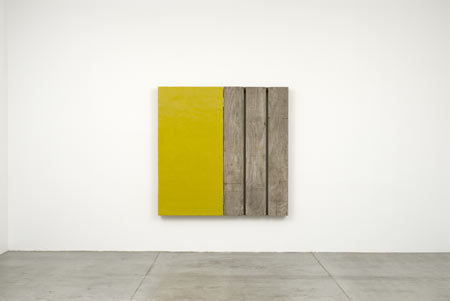
A reductive enquiry into the merger of architecture and light via painting, photography and sculpture are the hallmarks of Johannes Girardoni’s work. Titled “Light Matters,” the exhibition occupies two separate rooms in what could be two separate shows. But the longer we look, the more the lines of distinction between the various approaches are blurred and therefore united.
The main gallery houses sculptures which contrast found wood with a tactile paint composed of beeswax and pigments. Some are spilt in diptych fashion; the raw states of wood are paired with thick, cakelike painted sections. The result is a satisfying hyper-state of nature, as geometrical shapes rise from the patina with a dripping, oozing effect. Many of the pieces are voids and enclosures - empty and fully present, sexy and spare, hollow yet full.
While monochrome surfaces and content are implied, even when processed as such, the experience of any one color is multidimensional. Light intervenes. His odd mustard in “Diptych – Yellow Green” reminds us how curious and transient color from the natural world is, inviting but also strangely plastic and saturated. The rough found wood is celebrated as such, looking like it just left the farm. The placement of the pieces utilizes just about every surface in the space – on the walls, lying flat on the floor and somewhere in between. They are individuals in conversation with each other, and remind us that the artist is known internationally for his installations. Indeed, the artists will present an interactive light and sound installation at the 54th Venice Biennale later this year.
Digital photographs of billboards in both urban and rural settings are the springboard for Girardoni’s “Exposed Icons” series, housed in the second gallery. These pieces are montaged and layered, filtered with digital color and then painted with house paint. Creating a complicated maze and history of experience, Girardoni explores with ease the seams between digital and analogue realms. These icons are a compressed sculpture, once again presenting and repeating the light and the void. Every applied digital or painted color field takes its cues from the natural colors already captured in “reality,” engineering shifts in our perception of space.
The layers can be subtle with hidden histories of process, but in pieces like “Exposed Icon 5’” the paint is more the point. It is far from solid, leaving marks and traces of the artist’s activity, aiding the consolidation of many mediums into one. Perhaps the most convincing exploration of a readymade void is “Exposed Icon 21,” in which the billboard is a perfect white. It is then reflected back onto the Mojave Desert in the same blue as the sky above, thus producing a delicious double-monochrome.
