Continuing through May 23, 2015
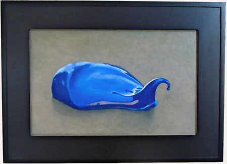
Remember Roy Lichtenstein’s long series of brushstroke paintings? Graphically flat and conceptually blunt, they weren’t really of course, but they were evocative of nothing else but. In direct contrast Robert Ginder signals us that his artworks do double (and then some) duty in a simple rendering of paint squeezed fresh out of the tube. He starts out from, but does not arrive at art about art. Not when that lime puddle he calls “Cartouche" has been left undisturbed by a brush. Taking the title at face value, we understand that paint is there to contain, to frame an image. It calls up the old notion that a block of marble has a figure in it which the sculptor is meant to liberate for all to see. A cobalt daub assigned the title “Kestrel,” a type of falcon, sports a sharp beak rising and curling out of the right edge of the paint. This unambiguous association may be a tromp l’oeil image, but it proclaims: Go no further! These most modest works in the show announce that there is something holy about paint. OK, now we may proceed. Come, let us worship art together.
The artist’s visual signature is not really witty conceptual tropes about the nature of painting as the above might imply. The calling card that makes you connect image with name is a modest post-war-era bungalow in the flats of mid-town or west side Los Angeles. It's crowned with palm trees and loaded with the details of what once signified suburbia and the mythological good life afforded by our middle class economy and Southern California weather and ambiance. The conceit that continues to make these paintings Ginder’s brand is the gold leaf, artificially aged by worrying the surface of the panel on which the paint and leaf are applied with the apparent care of a monk. The cracks enliven the surface and allow us to pretend that the object has come down to us through the centuries.
The liturgical association is intentional, Ginder’s way of forcing us to re-evaluate the ordinary. I do not advise you to see a seventy-year-old one bedroom as somehow becoming a palace that it is not; nor as somehow enjoying a spiritually elevated quality that kicks up its market value. During the centuries leading up to the invention of the printing press tremendous care and expense went into creating a relative handful of books of hours that only the wealthiest of royal patrons could afford. I have often reflected when flipping through modern facsimiles or viewing the real deal over at the Getty how the serious investment of labor and spiritual energy by the creators of these books tended to serve nothing more profound than the distracted amusement of an otherwise bored aristocrat trying to make it through a Church service. Does Ginder expect us to regard his images as moral allegories? I think not, but there it is.
Looking closely at a stellar example of what Ginder does best, “Luminous Corner” immediately inspires that feeling of a sacred quality inherent in the ordinary. It is enriched by a host of topical references with added symbolic meaning, starting with the most foreground object, a palm trunk that bisects the house and the composition. It calls to mind John Baldessari’s “Wrong.” That image is closely associated with the rise of Conceptualist art. This one returns the classical triangle both in terms of the surface of the composition and how it recedes into the visual space. The bungalow is viewed at not quite a 45 degree angle, the corners of the light blue residential box pushing the eye forward to regard the yellow fire hydrant. A hose sprinkler on the lawn forms a halo to the right of the foreground, and a globe-shaped lawn ornament completes the trio. Three massive palms jut above the roofline forming visual fireworks horizontally across the golden sky, whose more natural blue color resides in the structure below. Two more distant palms complement the variety of their cropped sister in the foreground. And the now extinct TV antennas’ sharp, thin lines balance between those palms and the cracks in the surface introduced by the artist to make it all feel old. One thing keeps leading to another and to another. The longer you stick with it the more it all begins to swirl. This is not one of Turner’s maelstroms, but don’t be fooled into regarding this as laid back California. Tranquility is not what’s being sold.
What Ginder succeeds in doing is to relate our — his own — recent past with a far older historical recall, to feel its depth and the cycle of repetition. “Luminous Corner” and “Ornelia” extend the timeline back around 500 years, but “Bird” and “Red” extend it back to the Greeks and Romans and beyond. What Ginder refers to as “Mudlarks” quote from found shards of pottery that may be ancient or comparatively recent. Knowing the age of what, for example, becomes his own “Bloom and Yellow” is quite beside the point. He enlarges these into something new merely by virtue of the change in scale. More interestingly he sets off a reverberation of time between the present and an imagined past. These are not precious objects, though there is a strong whiff of that, so much as visual prompts that make you wistful for a past that you are responsible for filling in and from which you keep returning.
Ginder’s body of work is thus not really an exercise in association, but recovery. We lose something, we recover it. History and archeology form a tight bond and Ginder makes it tighter.
Published Courtesy of ArtSceneCal ©2015
