Continuing through October 21, 2017
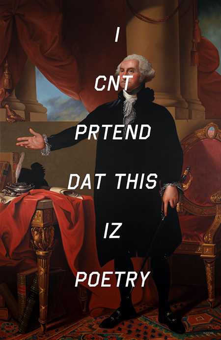
Denver artist Shawn Huckins has created a pantheon of 18th- and 19th-century American portraiture overlaid with smart-phone jargon phrases and computer screen icons. The results are a combination of art-historical tributes and up to the moment communication methods. The former comprises American historical icons of presidents and other worthies; the latter abruptly cancels out such reverence and staid respect. One can contemplate how art has played into creating elite visual signs or how today instant tele-communication levels out everything into a boring interchange that is quickly forgotten. The critical attitude about the originals is only faintly disruptive or resistant.
From New England originally, Huckins attended Keene State College in New Hampshire and has received grants from the Haven Foundation of Maine and the Connecticut Commission on Culture and Tourism. With a healthy gallery exhibition record that includes New York, San Francisco, Los Angeles and Boston, the 33-year-old painter meticulously recreates works by noted 19th-century American artists such as Gilbert Stuart, John Singleton Copley, Thomas Sully, Rembrandt Peale, Thomas Cole, Mathew Brady and Albert Bierstadt, only to deface them with phrases from the internet. Other than that juxtaposition, there are no other pictorial ideas present.
Working with such a device, however, viewers are treated to a walk-through tour of “famous American painters” who deserve to be revisited and commented upon. Indeed, the artist has provided elaborate notes on each painting which are available, fortunately. but not on the wall near each work. Titles and labels are enough to trigger our imagination. Huckins’ painterly abilities continuously draw the eye. We do not need to know the biographical details of each painter or subject that Huckins provides; the visual evidence is more adequate than his additional 700-word defense. Learned though Huckins may be, all that is superfluous background information compared to the impressive majesty of the artworks.
Some are quite tall, like “Mrs. James Warren: Blah Blah Blah” and “Washington (The Landsdowne Portrait)," both seven feet high. They mimic the scale of the originals and emphasize the importance of the sitter or the painter of the original artwork, such as Gilbert Stuart. “George Washington (The Athenaeum Portrait): lol nope” is based on the unfinished portrait of the first president that was sold by the Boston Athenaeum, America’s oldest private lending library, to the Museum of Fine Arts, Boston, and the National Gallery of Art, who share ownership of one of only seven Washington portraits executed by Stuart. The unfinished portrait is an apt metaphor for the unfinished nature of the American republic.
“Mrs. James Warren” is dressed in a sumptuous blue silk dress, sitting before a drawn curtain exposing the American landscape and wilderness. The larger “Landsdowne Portrait” includes a small medallion resembling the American flag on a chair behind the president. Few people know that the stars and stripes are based on the Washington family coat of arms from England.
Smaller works of acrylic on canvas depict other early Americans such as Richard Dana, one of the radical Sons of Liberty; third president Thomas Jefferson; Boston Athenaeum founder Richard Heber; and Mrs. John Biddle, whose literary moniker states “DELETE ME.” It is one of the few examples of humor in the otherwise sober, somewhat strained exhibition. One idea repeated over and over can become a bit wearying despite exquisite painting skills. The acrylic medium also speeds up things, compared to the studio time of the original oils and the accumulated sitting times of the portrait subjects.
Smallest among the works here, and the most delectable, are three landscapes based on important examples by Bierstadt and Cole (America’s greatest 19th-century landscape artists). Huchins condenses and intensifies the contrast between text and image. “Bierstadt’s Rocky Mountains” explodes the Yellowstone School artist’s approach to vistas with informal pencil scribbles at its base, while “Cole’s Cloud Study” is like a formal portrait of a cloud. Over the former are the “words” CTRL ALT DEL, as if the environment so revered at the time is now in danger of disappearance.
Best of all, “Evening Glow At Lake Louise” omits language altogether, settling for a color-code disk at the center of an effusively extravagant Canadian sunset. Only 12 x 16 inches, it reverts to 18th (or 17th-) century landscapes from France and England. Nonverbal, it links art methods to natural observation and reminds us quietly of the passage of time, the evolution of our attitudes to the environment, and the possibility of an artwork outliving its contemporary adjustments.
